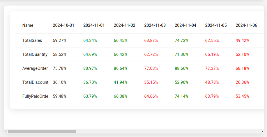
The Data Table on the AngularView dashboard is a powerful companion to the chart, designed to present the same data in a structured and interactive format. This table enables merchants to dive deeper into their data by providing clear numerical or percentage values for various metrics across selected time grains, making it ideal for detailed analysis and reporting.
How Does the Table Work?
- Switch Between Figures and Percentages:
- Just like the chart, the table offers two modes of representation:
- Figures Mode: Displays raw numerical values (e.g., total sales in dollars).
- Percentages Mode: Shows values as percentages relative to the maximum value within the selected period.
- Toggle between these modes to suit your analysis needs.
- Just like the chart, the table offers two modes of representation:
- Time Grains (Columns):
- Each column in the table corresponds to a selected time grain:
- Daily: Break down data by individual days.
- Monthly: Summarize data for entire months.
- Quarterly: Aggregate data for three-month periods.
- Use the Time Grain Selection buttons at the top of the page to switch between these granularities.
- Each column in the table corresponds to a selected time grain:
- Interactive Column Selection:
- Click on one or multiple columns to toggle their selection.
- Selected columns are highlighted and dynamically reflected in a detailed breakdown section at the bottom of the homepage.
- This lets you compare specific time periods or focus on particular segments of your data.
- Key Metrics (Rows):
- Rows represent the same metrics available in the chart:
- Total Sales
- Total Quantity Sold
- Average Order Value
- Total Discounts Given
- Fully Paid Orders
- These metrics are easy to scan and interpret in tabular form.
- Rows represent the same metrics available in the chart:
Why This Table Matters: Solving Real Problems
- Simplifies Data Comparison:
- Comparing numerical values across different time grains is easier in a table format. For instance, spotting trends like “sales dropped in Week 2 compared to Week 1” is straightforward.
- Facilitates Reporting:
- Tabular data is ideal for exporting or presenting to stakeholders, especially when you need exact values or percentages.
- Enhances Granular Analysis:
- With column selection and bottom-page breakdowns, you can zoom into specific time periods and uncover hidden trends or anomalies.
- Complements Visual Analysis:
- While the chart excels in showing relationships between metrics, the table ensures that exact values and percentages are readily accessible.
The Value It Brings to Your Business
- Precision and Clarity:
- Numerical data is displayed clearly, ensuring you have the exact figures needed for decision-making.
- Customizable Comparisons:
- By selecting specific columns (time grains), you can easily compare periods and measure the effectiveness of campaigns, promotions, or strategies.
- Actionable Insights at a Glance:
- Percentages mode helps you identify peaks and troughs in performance quickly, highlighting periods that need attention.
- Streamlined Reporting:
- A tabular format makes it easy to export, share, or present data during team meetings or strategy sessions.
How to Use It Effectively
- Select the Right Time Grain:
- Start by choosing a time grain (daily, monthly, quarterly) that matches the scope of your analysis. For short-term campaigns, use daily; for strategic planning, use monthly or quarterly.
- Toggle Between Modes:
- Use Figures Mode for precise values or Percentages Mode to analyze trends relative to peak performance.
- Focus on Key Columns:
- Click on columns to highlight the time periods that matter most (e.g., days with promotional activity or weeks with unexpected drops).
- Leverage the Breakdown Section:
- After selecting columns, review the bottom-of-page breakdown to see detailed insights for the chosen periods. This is where you’ll find actionable patterns and trends.
How This Table Helps in Real Business Problems
- Promotion Performance Tracking:
- Problem: Which days during a promotion saw the biggest sales spike?
- Solution: Select the Daily Grain, toggle columns for promotion days, and view the percentage increases in Total Sales and Fully Paid Orders.
- Seasonal Trends Analysis:
- Problem: How do Q1 sales compare to Q2?
- Solution: Switch to the Quarterly Grain and review Total Sales and AOV metrics side-by-side for each quarter.
- Operational Challenges:
- Problem: What time period saw the highest unfulfilled orders?
- Solution: Use Figures Mode, select the relevant metric, and compare across daily or weekly grains.
- Customer Behavior Insights:
- Problem: When did customer refunds peak during the last month?
- Solution: Select Refunds and toggle days within the Daily Grain to pinpoint patterns.
Pro Tips for Better Insights
- Use Percentages for Quick Comparisons:
- Percentages mode is perfect for spotting peaks and trends at a glance, even when working with metrics of different scales.
- Select Multiple Columns for Focused Analysis:
- Comparing only the periods that matter (e.g., campaign weeks or peak seasons) can help you isolate valuable insights.
- Pair with the Chart:
- Use the chart for relationship analysis and the table for precise numerical or percentage data.
- Export for Stakeholders:
- Consider exporting table data (via screenshots or reporting tools) to share insights with non-technical teams.
- Combine Metrics for Actionable Insights:
- For example, compare Total Sales, Total Discounts Given, and Fully Paid Orders over the same period to assess the effectiveness of pricing strategies.
The Takeaway
The Data Table on AngularView’s dashboard transforms your metrics into clear, actionable insights. By combining figures and percentages, interactive column selection, and time grains, it empowers you to make data-driven decisions with ease. Whether you’re tracking promotions, analyzing seasonal trends, or understanding customer behavior, this table is your go-to tool for precision and clarity.