Running an eCommerce business means staying on top of countless metrics—sales, discounts, refunds, quantities, and more. The problem? These metrics are often scattered across platforms, making it nearly impossible to connect the dots between them.
That’s where AngularView comes in. Instead of navigating disconnected spreadsheets and clunky reports, AngularView brings everything into one place—letting you move from reactive decisions to proactive strategy with just a few clicks.
Whether you’re an apparel brand, electronics store, or homeware merchant, AngularView helps you visualize trends, identify opportunities, and optimize decisions with ease. If you run a fashion store, AngularView helps you uncover which product lines are trending, how returns affect your margins, and how discounts influence sales performance. For electronics stores, it highlights fulfillment bottlenecks and high-performing SKUs over time. for gaining a 360° view of your Shopify business.
With two modes—Radar Mode(%) for comparisons and Value Mode($) for precision—you can see your data from every angle, exactly how you need it.
Dashboard Overview
The Dashboard gives you a big-picture view of how your store is performing across different dimensions. It acts as your command center, bringing together key metrics that span sales, operations, and customer behavior in one unified space.
Rather than just presenting numbers, it helps you understand the underlying relationships—how discounting may increase refund rates, or how spikes in sales could delay fulfillment. This makes it easier to spot inefficiencies, double down on what’s working, and take corrective action where needed. Rather than just presenting numbers, it focuses on how metrics influence one another—for example, how discounting affects refunds, or how high sales impact fulfillment delays.
The Dashboard consists of two main sections:
- Top Section: Interactive visual charts and tables.
- Bottom Section: Predefined and personalized dashboards.
Top Section: Performance Correlation View
The Dashboard’s top section is designed for fast discovery and pattern recognition – especially when metrics look unrelated at first glance. It helps you answer questions like:
- Are my discounts driving more sales or more refunds?
- Is there a link between processing delays and cancellations?
- How do sales change between promotional and regular periods?
- …..
This section presents two powerful ways to understand your store’s performance:
- Relative Performance View (Radar Chart View)
- Absolute Metric Trends (Line Chart View)
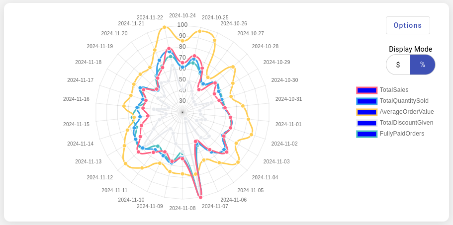
1. Radar Mode – Relative Performance View (Radar Chart)

The Radar Mode renders your metrics as a radar chart. It normalizes each metric based on its highest value during the selected period—setting the peak to 100% and scaling the rest accordingly.
This adjusted radar view makes it easier to spot interdependencies between metrics, especially during campaign analysis or operational reviews.
This lets you:
- Compare metrics with different units (like sales vs. returns)
- Reveal hidden correlations across KPIs
- Spot missed opportunities or red flags quickly. Each metric is normalized by its highest value within the selected timeframe—the peak becomes 100%, and other values are scaled accordingly.
- Spot correlations or divergences in performance patterns
- Identify outlier periods quickly
Hovering over points allows you to see values and dates.
2. Value Mode – Absolute Metric Trends (Line Chart)
Switch to Value Mode to see actual numbers in line charts—ideal for precision-based comparisons like:
- Confirming the exact sales amount from a flash sale
- Measuring how many returns followed a high-discount campaign
- Monitoring fulfillment or processing delays over time

Switching to the $ view presents actual values over time as line charts. Unlike the radar view, this shows the raw dollar or quantity values, making it ideal for:
- Tracking revenue and sales volume
- Reviewing cancelled or returned orders over time
- Monitoring order fulfillment issues
For example, use this when tracking a product launch, where you want to monitor how sales, returns, and fulfillment evolve each day. Or use it to identify refund spikes that coincide with specific promotions or fulfillment delays.
The table beside the chart shows matching numeric data. Clicking a column highlights the related line in the chart for better visual comparison
✅ Use this when you want granular, real-world values rather than relative comparison.
Adjusting Time Frame and Granularity
Use the two buttons above the top section to customize the view:
![]()
Time Frame Selector: Choose from presets like “This Month”, “Last 30 Days”, or set a custom date range.
Time Breakdown: Toggle between daily, monthly, or quarterly views to analyze trends based on the rhythm of your business.
Bottom Section: Metric Drill-Down View
Once you’ve explored overall patterns in the top section, the bottom section lets you drill down into finer details—breaking trends into smaller time intervals and surfacing context-specific insights.
This area is automatically populated when you click a column in the top table. For example, clicking a quarter brings up monthly-level tiles below, clicking a month reveals daily-level metrics; and clicking a day reveals insights by hour.
Each tile represents one individual metric, visualized in either % mode (relative) or $ mode (actual values), just like the top section.

Flexible Tile Setup
Tiles are configurable via the Add/Edit Tiles button, allowing merchants to focus on the metrics that matter most to them—be it returns, sales, or fulfillment issues.

Each tile includes a radar or line chart for visual exploration, a summary panel showing min, max, total, average, and other aggregations depending on the metric, and toggle buttons for % and $ modes.

Compare Different Time Periods
One of the most useful capabilities of the bottom section is its ability to let merchants compare any two time periods, regardless of how far apart they are.
For example, click March 2023 and November 2023 in the top table—each selection loads corresponding tile data below for easy side-by-side analysis. You can compare performance before and after a product launch, a seasonal sale, or an operations change.
This enables campaign performance reviews, operational efficiency comparisons, seasonal trend validation, and many more.
Compare the Same Point in Time Across All Metrics
Beyond time-based comparisons, the tiles also allow for cross-metric correlation. When you click on any point within a tile, an orange vertical line appears at that time position across all tiles. This helps you quickly align all metrics to the same timestamp, Spot if a spike in one area (e.g., Sales) coincides with changes in others (e.g., Returns, Fulfillment Delays)
Built-In Shortcuts for Further Exploration
Some tiles include links to related dashboards. Clicking a tile’s header may take you straight to a deeper view.
This makes the bottom section not just a drill-down, but a launchpad for deeper analysis.

How tiles can help you?
Some examples where the tiles features can help you include
- Campaign Comparison: Click into December and February to compare two marketing events side by side
- Refund Tracing: Spot the daily pattern of returns following high-discount days
- Fulfillment Investigation: See if order delays align with surge periods, specific SKUs, or geographic clusters
- Disconnected Metrics Analysis: See how one action (e.g., giving discounts) impacts another (e.g., fully paid orders count). The chart visually connects the dots, so you don’t have to guess.
- Trend and Correlation Analysis: Seasonal or campaign-related patterns often get lost in complex reports. This chart highlights them clearly with Radar Mode’s percentage-based comparisons.
- Complex Analysis Simplified: Metrics like Sales and Quantity Sold have different units, making them hard to compare. Radar Mode normalizes them into a single scale, making relationships instantly visible.
- Reactive Decision-Making: Move from reactive to proactive planning by spotting anomalies and acting on them early—whether it’s a drop in sales or a rise in refunds.
💡 Pro Tip: Use the tile view to validate or disprove assumptions. Think returns are up because of discounts? Click and compare.
Together, the top and bottom sections allow for a full-cycle insight loop—from identifying the what in the top section to uncovering the why in the bottom.
It saves your time ⏱. Forget juggling spreadsheets—just select your metrics, toggle the view, and instantly see what’s driving your results.—from pattern discovery to root-cause analysis.
Metrics You Can Analyze
One of AngularView’s core strengths is the breadth and depth of available metrics, and how easily you can cross-analyze them to uncover powerful insights. Instead of just seeing totals, you get actionable context—how each metric affects another and where improvement opportunities lie.
With this interconnected view of metrics, you’re not just looking at data in silos. You’re uncovering the story behind the numbers; an eagle eye view of your store.
Sales Metrics
- Total Sales – Track your revenue over time. For example, compare total sales before and after launching a campaign to measure ROI.
- Total Quantity Sold – Identify high-demand periods or best-selling SKUs and align stock levels accordingly.
- Average Order Value – Spot trends in upselling or bundling effectiveness; monitor whether discounts are impacting average spend per order.
- Total Discount Given – Monitor discounting practices to ensure profitability isn’t being undermined. Helps balance promotions vs. margin control.
Order Status Metrics
- Fully Paid Orders – A key indicator of conversion health. Sudden drops may suggest checkout issues or payment errors.
- Cancelled Orders – High cancellation rates might reflect UX friction, buyer’s remorse, or fulfillment delays.
- Returned Orders – Monitor return spikes after sales periods to evaluate product quality, customer satisfaction, or sizing/fit issues.
- Unfulfilled Orders – Keep an eye on operational bottlenecks and spot if your logistics team is underperforming.
- Non-Fulfillable Quantity – Quickly catch inventory sync or overselling issues before they impact customer satisfaction.
- Orders Requiring Shipping – Understand logistics workload and predict shipping demand for future planning.
- Order Processing Time (Hours) – Diagnose internal delays. A great KPI for warehouse performance and automation potential.
Customer & Geographic Metrics
- Unique Orders – Track overall customer engagement. Useful when measuring new vs returning buyer ratios.
- Unique Shipping Cities – Identify emerging markets or regional demand clusters. Helps shape geo-targeted marketing.
- Unique Shipping Zip Codes – Use zip-level data for hyper-local campaigns or delivery strategy tweaks.
- Unique Currencies – Perfect for international stores. Monitor activity by currency to assess cross-border expansion opportunities.
🧠 You can combine metrics like ‘Total Discount Given’ and ‘Returned Orders’ to evaluate if heavy discounting leads to high return rates—a common merchant blindspot.